Page 1 of 1
Unread Posts Icon
Posted: Thu Sep 30, 2021 11:19 pm
by GCoyote
If you could make that little read "unread post" icon just a little bigger that would be great.
It's okay on the large desktop PC but it's a little hard to see on mobile devices and not forgiving of my stubby fingers.

- Go to unread posts.PNG (12.72 KiB) Viewed 4529 times
Re: Unread Posts Icon
Posted: Fri Oct 01, 2021 3:04 am
by Gordon
I will take a look.
Re: Unread Posts Icon
Posted: Fri Oct 01, 2021 6:08 pm
by Gordon
Okay,
I’ve been doing some research on the problem.
The icon you are referring to is a clickable image, however, attempting to increase the size causes all kinds of formatting problems. So the best we can do is offer suggestions to work around it.
1. PDA (cell phones and tablets with touch screens). By using 2 fingers (or your thumb and index finger) you can place time on the screen and slowly spread them apart to enlarge the screen. Once you have clicked on the image, use your two fingers and slowly close them together to reduce the screen size.
2. There are a couple of places you can locate links to display “new posts”. One is located on the Portal page (on smaller display devices it’s located towards the bottom of the page) Locate the Menu and click on “Unread Posts” this will display all new posts since your last visit.
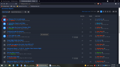
3. If you view the main page you will see that some of the icons are in blue while others are in black. The blue icons are topics containing unread posts. (see
attachment 1)

- Attachment 1
If you click on the icon it will take you to the subtopic and you will see topics with both blue and black icons. The blue again have unread topics, just click on one and it will take you to the first unread post (see attachment 2).

- Attachment 2
Try those methods out and if you are still having problems let me know and we will see if we can help.
Thanks
Re: Unread Posts Icon
Posted: Tue Oct 05, 2021 12:52 pm
by GCoyote
Okay, not too serious.
Main difference is that the red icon takes one directly to the first unread post in the specific forum of interest.
The other methods require at least one additional page load before you get to the desired post.
Write it off as just another 21st Century non-problem.
Thanks for looking into it regardless. The new dark themes are excellent otherwise.